Just reporting an issue: When Im at my garage editing, the right table goes right down over top of my pics.. PM me and ill take a screen shot.

Site Updates
- Thread starter Jay Jay
- Start date
these problems are keeping me from enjoying the threads i frequent. Is there a solution to these problems?1. The banner for ROTM is f**king HUGE!!!!! Damn thats a huge b***h. If it could be resized a bit so I dont have to scroll so much that be great!
2. Why is everthing so squished in the middle? I have these bars on the side that are pretty much pointless.
Hasnt the site always been aligned centered?? or are you referring to something else?i think it looks good but i dont like the fact it is centered like it is
is the #333333 the web color you had in the beginning with this new layout? i just got on for the first time today and the text looks darker than yesterday when i posted my thoughts on it being too light...anyways whatever you changed it to, the readability is alot better. As a graphic designer and newbie web developer myself, I really enjoy your designs and talent. Keep up the good workYeah, good point. I'll make the featured not so tall for those on widescreen. I'm not sure what everyone is seeing, the gray is #333333 which is the darkest web gray for the font color.
wasnt there always empty space on the side? the main content area and side bar content/links are expandable so when there is more information in the main content area, you will have empty space on the side..lol thats just how it goes. unless you are referring to something elseI like the new style, but everything is kind of smashed in the middle with tons of empty space on the sides.
that is just the backgroundMy only gripe is the useless gray sidebars. Any way to get rid of them?
oh and another thing, as someone else mentioned...everytime i come to the site, it jumps down to almost the very bottom of the page..any thoughts on why its doing that?
in my experience with the auto pic resizer... i run an older laptop... has a P3 and onboard graphics.. the page will be finished loading... but it will be choppy when i go to scroll down when i come across a pic that has been auto resized.so with a whole page of nothing but auto resized pics.. it will take me 10 min to view the entire page...
no me gusta 6" of wasted space on each side.
Im glad to see im not the only one having this issue.oh and another thing, as someone else mentioned...everytime i come to the site, it jumps down to almost the very bottom of the page..any thoughts on why its doing that?
This is a problem with one of the google advertisers I'm going to email google to let them know. It puts a focus on the drop-down menu in the ad on page load. gay.Im glad to see im not the only one having this issue.
If you can help me think of a better way I would love to get rid of the sidebarthere has to be a better way to give sponsors exposure other than a sidebar.
anfrey
OG スバリスト
Registered VIP
Registered OG
5+ Year Member
10+ Year Member
15+ Year Member
20+ Year Member
i'll do some brainstorming, since the sidebar has a tendency to overlap with vital page elements...If you can help me think of a better way I would love to get rid of the sidebar
i agree 100%Can you please please please PLEASE make the post body scalable instead of fixed at 640x480?
Please?
ImportFan1
Super Moderator
Staff member
Registered VIP
Registered OG
5+ Year Member
10+ Year Member
15+ Year Member
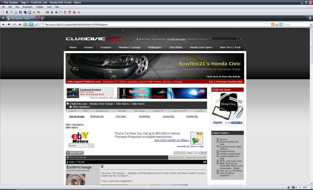
x3. Here is what I seei'll do some brainstorming, since the sidebar has a tendency to overlap with vital page elements...
i agree 100%

Is there a way to fix all the wasted space on the sides of the screen yet?!?
Mr. Jollypants
Mr. f**king Jollypants
Registered VIP
Registered OG
5+ Year Member
10+ Year Member
15+ Year Member
I really liked the other font color before it went back to black.
all that is, is simply the background. a ton of sites have backgrounds...i dont see why this is bothering peopleIs there a way to fix all the wasted space on the sides of the screen yet?!?